TOPIC DETAILS

  Team Member Role(s) Profile
Paul Banaszkiewicz Paul Banaszkiewicz Section Editor
Munier Munier Hossain Segment Author
SattAR Sattar Alshriyda Segment Author

Medical statistics

  • Medical statistics is about making an educated guess regarding the probability of events.
  • When one wants to find the truth with regard to some research question one undertakes research.
  • Ideally this should involve the whole population at risk.
  • For example, it we wanted to know the risk of lung cancer in smokers we should investigate each and every single smoker.
  • This is not practical therefore we choose a sample of smokers.
  • Studying this sample of smokers we get a certain number who contracted lung cancer.
  • We do not know if this number is true for the actual population as we only studied a small sample (how many of all the smokers actually develop lung cancer?).
  • Medical statistics allows us to make an educated guess as to how close we are to the real truth or what is the probability that the number we found was purely out of chance.
  • This is important since in real life events can occur purely by chance due to random variation.
  • When we actively intervene to treat a medical condition we would be interested to know whether the effect was indeed due to the intervention and not due to pure chance or the placebo effect.

BS11STATISTICS1.png

Figure 1. Comparison of effect of spontaneous improvement and placebo to active intervention. From Krogsboll et al. Spontaneous improvement in randomised clinical trials. BMC Medical Research Methodology. 2009,9:1. 

·       Any measurable factor is a variable (age, weight, height, sex, etc.).

·       It is important to understand the difference in variables as this dictates the type of statistical test we can perform.

·       Broadly speaking variables are of two types: categorical and numerical:

o   Categorical data are grouped into categories.

o   Numerical data are ,well,numbers.

·       Categorical data can be either binary (of two types) or more than two types

·       Binary: smoker, non-smoker, dead or alive.

·       More than two types: nominal or ordinal:

o   Nominal: categories are not ordered: eye colour, blood group.

o   Ordinal: categories are ordered: patient satisfaction, tumour stage, etc.

·       Numerical variables can be discrete or continuous:

o   Discrete: counts: number of adults.

o   Continuous: height, blood pressure, etc.

BS11STATISTICS2.png 

Figure 2. Classification variables

Descriptive statistics

  • When we measure variables we generate data.
  • We need a meaningful way of expressing data and communicating this to others.
  • Generally we are interested in: measures of central tendency and measures of spread:

        - Central tendency: can be mean, median or mode.

        -  Spread/dispersion: range, interquartile range, variance, standard deviation.

  • Mean is the average value
  • Median is the middle observation.
  • Mode is the most common  observational value.
  • Although mean is the average value this is not always representative of the data and therefore we need other types of average value (mode or median)
  • Mean is a representative middle observation for parametric data ( data that follows a “normal” distribution).
  • Median is the value used when data are non, parametric.
  • This may be required in cases where the presence of extreme values (known as outliers) skews the data distribution.
  • We also need measures of spread because an average value on its own does not convey enough information about the data.
  • A simple way is to describe the range which is the difference between the upper and lower figure.
  • If the data has outliers it is useful to describe the interquartile range.

Count the number of observations

Suppose we have 16 observations:

1,2,3,4,5,6,7,8,9,10,11,12,13,14,15,16

Divide the total no. of counts by 4, 16/4= 4 is the no. for the first quarter

4x3=12 is the number for the third quarter

Therefore inter-quartile range is between the 4th and the 12th observation= 4-12


·      
Box  plot: this is a graphical representation of interquartile.This is used when data are not normally distributed.

·       Figures 3 and 4 explain this..

·       The problem with these approaches is that they only give information regarding the difference between the high and the low score but do not give any information regarding the spread of data away from the mean.

·       To convey this information we need standard deviation.

·       Before going any further it is important to understand normal distribution.

BS11STATISTICS3.png

 Figure 3. Explanation of a box-plot.Note Median and not mean as the horizontal midline. Box plot is used from non-parametric or non-normally distributed data 


BS11STATISTICS4.png

 Figure 4 Example of an actual box-plot comparing changes in Oxford hip score in a cohort of patients undergoing total hip replacement surgery

The normal distribution

·       Many of the variables we study in real life when plotted will follow a normal distribution. This means that in life much of the data are evenly spread and centred around the mean with only a few outliers.

·       The graph is also known as the bell-shaped graph. Data for normal distribution are so symmetrical that mean, median and mode fall on the same line.

·       This means that 50% of samples of the data lie below the mean value and 50% above.

·       Data two standard deviations away from the mean would represent 95% of the dataset.

·       As this distribution is already known we can utilise this to compare any new data and compare their position in relation to the normal distribution.

·       It is important to understand whether our dataset is normally distributed or not. Data that are not normally distributed behave differently from data that are normally distributed, they are not symmetrical.

·       Therefore the type of statistical test that is performed takes this into account. Parametric tests are performed for normally distributed data and non-parametric tests are performed for non-normal data.

·       Once data are gathered it is important to check how the dataset is distributed before undertaking a statistical test.

BS11STATISTICS5.png

Figure 5 Graph of a normal distribution

BS11STATISTICS6.png

Figure 6 Different types of bell shaped graph.They vary in steep ness but are all symmetrical and therefore normally distributed

·       Many biological variables have a normal distribution (age, weight, height, etc.).

·       Normality of data can be assessed by visually plotting the data or by special tests (Shapiro–Wilks test etc.).

·       When data are not normally distributed they develop a tail.

·       This is known as a positive or a negative skew.

·       This means that the mean gets pulled by the outlier to the same side.

·       Therefore in skewed data the mean is at the same side as the tail.

·       A positive skew means that data on the right side are longer than the left and vice-versa.

·       If data are skewed then non-parametric tests need to be performed.

·       Parametric tests are more powerful and more convenient to perform.

·       Therefore another option when testing non-normal data is to transform the data by doing a logarithmic test and then performing parametric tests on the transformed data.

·       This does not affect the integrity of the statistical inference.

·       However, parametric test cannot be performed on non-normal data.

BS11STATISTICS7.png

Figure 7 Positive and negative skew

BS11STATISTICS8(a).png

BS11STATISTICS8(b).png

Figure 8(a) and 8(b).Example of logarithmic transformation. The top graph shows negatively skewed data the bottom graph shows that following logarithmic transformation the tail is greatly reduced

Standard deviation (SD)

·       SD describes the variability in a sample.

·       Or in other words how far the typical values differ from the mean.

·       It is the square root of variance.

·       Variance is the average of the squared differences from the mean.

·       We need to square the differences as the sum of simply adding differences would be 0.

·       However, variance is an artificial value that does not have any bearing to real differences.

·       Therefore the square root of the variance gives a measure that has some semblance to real differences.

·       This is known as the standard deviation.

·       It can be thought of as an average of the deviations of all the observations from the mean of the observations.

·       Working out the standard deviation gives an idea of what is normal (within 2 SD of mean) and what is abnormal (outside of 2 SD from the mean).

Variance

BS11STATISTICS9.jpg

Figure 9.Varience 

To calculate variance

Find out the mean

Calculate the difference from the mean for each datum

Square the difference

Calculate the average of the squared differences

SD is the square root of variance

SD = σ

Variance = σ2

Standard error of the mean (SE)

·       We previously discussed that our study population is only a sample of the true population and our study is an attempt to make an educated guess of the true population mean9which is unknown).

·       Unless we are really lucky it is unlikely the sample mean and the population mean would be the same.

·       To get an idea of how close our sample mean is in relation to the population mean we need to measure how precise our estimation of sample mean has been.

·       This is found by calculating the sample error of the mean (SE) or Standard Error.

·       SE gives an idea of how good an estimate the sample mean is of the actual population mean, the smaller the SE the less error there is in our estimate.

·       From the formula we can see that SE is affected by the sample size and the SD.

·       This is intuitive, clearly the larger the sample, the more likely we are to be nearer to the actual population mean.

·       Similarly the larger the variability in the population (variance) the greater the SE.

Formula for standard error

SE = SD/√n

For example if

SD = 100

N = 25

SE = 20

If

SD = 100

N = 100

SE = 10

Confidence interval (CI)

·       SE gives us an estimate of our uncertainty.

·       However, it is not very helpful or intuitive to understand, for a more helpful measure we need the confidence interval (CI).

·       CI is the extent of uncertainty of anymeasure .It can be thought of as an average of the deviations of all the observations from the mean of the observations.

·       For most statistics we are interested in 95% CI which are within 2 standard deviations of the mean.

·       What this means is that we are 95% sure that the actual population value (that we do not know but intend to guess from the sample value) is within this range.

·       Therefore, if we were to repeat the same test again and again 95 times out of 100 our sample mean would lie within this range.

·      Hence  CI is a range of probable values for the true but unknown population value.

·       This obviously means that the broader the CI the less certain we are and vice versa.

·        CI can also function as a hypothesis test.

·       If the CI of the effect measure of two different interventions do not overlap then the difference between them is statistically significant.

             -    CI= Sample estimate  ±1.96 SE

BS11STATISTICS10.png


·       Example of CI (Figure10): suppose the green line represents the range of possibility for the population parameter (0–1). The black mark is the mean value and the blue line is the CI. We think the population mean may be at the black point (0.4) but we are 95% certain that the true population value lies within the blue line range (0.2–0.6). We would therefore write as follows: estimate 0.4 (95% CI 0.2–0.6).

Hypothesis testing

·       When we undertake research we are usually interested in finding if an intervention has any therapeutic effect.

·       We observe some therapeutic effect in the study population.

·       We are interested to know whether this is a real effect or whether this was due to chance/placebo effect etc.

·       In statistical universe the convention is to start with the status quo or in other words start with  the assumption that the intervention has no effect.

·       This is known as the null hypothesis denoted by Ho.

·       This is assumed to be the default position unless disproved by study results.

·       If the null hypothesis is disproved by the study results then we reject the null hypothesis and accept the alternative hypothesis.

·       The null hypothesis can never be proved.

·       An analogy is innocent until proved guilty.

·       If the prosecution fails to prove guilt(not innocent) then the person remains innocent.

·       For example, suppose we are interested in the outcome of shoulder function following cuff tear, if we intervene with cuff repair and wish to compare its efficacy to physiotherapy we start off with the null hypothesis that "in patients with a rotator cuff teat" there is no difference in outcome between tesr repair and physiotherapy for shoulder function.”

Constucting a null hypothesis

A trial between new wonder surgery A versus old conservative treatment B for management of condition C

Ho = There is no difference in outcome between new wonder surgery and old conservative treatment for management of condition C

·       We generate some results from the study.

·       Next we perform statistical tests 

·       When we perform these tests what we are doing is testing the probability of observing the study results by chance if the null hypothesis was true.

·       In other words if in the previous trial we found that cuff repair appeared to produce great functional improvement compared to physiotherapy we would ask ourselves what is the chance this result was a fluke?

·       This probability is termed the “P value.

·       If we find that there is only a 5% probability that the results could be due to chance then we say it is unlikely that the null hypothesis is true and we reject the null hypothesis.

·       It is important to remind oneself that we may still be wrong in 5% of cases!

·       It is therefore important to understand what we mean by the term “statistically significant” in results. All it means is that the difference that we observed was less than 5% likely to have been observed by chance. Nothing more.

The P value

·       P value is simply the strength of evidence against the null hypothesis.

·       In other words it simply informs us how likely is it that the difference in two treatments that we observed was purely due to chance.

·       P value is not an indication of the strength of treatment.

·       If the P value is less than 5% we consider this to be “statistically significant.”(the difference that we observed was less than 5% likely to have been observed by chance)

·       This does not necessarily mean the observed difference is clinically significant.

·       If the P value is greater than 5% this does not mean there is no difference between the two treatments, it simply means there is a greater than 5% probability that the difference could have arisen by chance.

·       P value in isolation gives no idea about the size of the treatment effect or the statistical power.

·       Confidence interval is a better marker in this respect as CI gives an idea about the size of the treatment effect and the degree of our uncertainty regarding the treatment effect.

·       It is also important to understand the difference between statistical significance and a clinically important difference.

·       An observed drug or intervention may have a statistically significant difference but this may not be clinically significant.

·       If we consider the example of rotator cuff tear and treatment with cuff repair versus physiotherapy we might wish to investigate pain as an outcome of interest and therefore be interested in documenting visual analogue score (VAS).

1.     Suppose we find a 3 mm difference in VAS in favour of cuff repair (on a VAS scale of 0–100 mm) and a P value of 0.02.

2.     Suppose we find a 12 mm difference in favour of cuff repair (VAS scale of 0–100 mm) and a P value of 0.20.

·       This merely means that the observed difference in VAS (3 mm) is unlikely to have happened due to chance and is likely to be a real effect. It does not tell us how good cuff repair is and the 3 mm difference may not be clinically significant nor apparent to the patient. Therefore, although cuff repair might have demonstrated a real difference in pain but the difference is so minor we might ignore it even though the P value  would mean we reject the null hypothesis.

·       In the second example although the observed difference is impressive the P value tells us that this might have arisen purely out of chance therefore we accept the null hypothesis.

Type I and type II error

·       Type I error means a false positive result.

·       We already discussed that if the possibility of an observed difference being due to chance was less than 5% we reject the null hypothesis and consider the result to be significant.

·       Therefore in 5% of cases we might be wrong.

·       This is type I error or α error.

·       An easy analogy is a false alarm when there is no fire but the alarm goes off.

·       Conversely, if we wrongly accept the null hypothesis and decide that there is no difference when there is one then this is type II error or false negative or b error.

·       Keeping the fire alarm analogy this is similar to a fire alarm not going off when there is a fire.

·       It is set by convention at 20%.

·       Power of a study is 1 – b = 80%.

BS11STATISTICS11.png

Figure 11. Type I and II errors

Power and sample size calculation

·       Power is the ability of a study to detect an effect difference, if it is really present.

·       If the study is not adequately powered or low then we may not be able to identify the difference in effect size and as a result we may commit a type II error.

·       If power is high and there is no statistically significant difference then we can be certain that such a difference does not really exist.

·       Therefore, if we accept a null hypothesis in a study it is important to be certain that the study was adequately powered.

·       Power depends on a number of factors the most important of which is the sample size.

·       In published research the most common reason for committing a type II error is because of too small a sample size.

·       Power analysis is the method of determining the number of subjects one needs in a study to have a reasonable chance of demonstrating a difference (if such a difference exists in reality).

·       Therefore, it is essential to perform a power analysis before a study commences so that an appropriate number of participants is recruited to the trial.

·       Let us consider the rotator cuff trial again. Suppose we decided following the trial that there was no difference in outcome between cuff repair and physiotherapy. However, it is possible that we came to this conclusion on the basis of the P value purely because the sample size was so small that the statistical test was unable to determine if the observed difference was due to chance or not. This is type II error. The small sample size means that the study was not adequately powered to detect the true difference.

BS11STATISTICS12.png

Figure 12. Power and sample size

·       Example of relation between sample size and P value for the same effect size. Each of the trials had the same effect difference but because of the smaller sample size the first two trials were unable to detect the difference.

·       With a bit of thinking this becomes clear, in the first trial the difference between the observed effects was (2 – 3 = 1), statistics thinks that it is quite possible for this difference to have happened by chance, a 10 difference is less likely and a 30 difference is even less so.

·       Power of a study depends on:

o   Sample size

o   Study design

o   α value

o   Size of the difference we are interested in

o   Variance

·       It is important to realise that sample size calculation is a rough calculation and is often based on a simplified design of the study.

·       While critically appraising a study it is important to go over the details of sample size calculation to be certain the calculation was valid.

·       There is published evidence that sample size calculation is incorrect or inadequately described in many studies.

·       Sample size calculation is also a conservative estimate.

·       It does not take into account loss to follow-up.

·       When recruiting participants it is good practice to take this into account and increase the sample size accordingly.

·       Sample size estimation is best done based on the results of an initial pilot study but often it is performed based on historical data that may not reflect the population to be studied.

·       Although a number of statistical packages are available to help estimate sample size calculation it is best to take advice from a statistician.

What type of statistical test

·       We have been discussing statistical tests to test the null hypothesis.

·       There are many statistical tests and the type of test to be performed depends on the:

o   Type of data (categorical or numerical).

o   Normally distributed or not (parametric or non-parametric).

o   Single, two or multiple groups.

o   Independent or related sample.

BS11STATISTICS13(a).png


BS11STATISTICS13(b).png

Figure 13. Flow chart indicating choice of test for binary variables (top) and numerical variables (bottom). From Petrie A. Statistics in orthopaedic papers. J Bone Joint Surg Br 2006; 88-B: 1121-36.

Chi square test (X2 test)

·       This is a test for binary variables.

·       This is also known as the test of proportions.

·       Two variables are plotted in a 2 ´ 2 contingency chart.

·       This can also be performed for more than 2 ´ 2 tables.

·       Categories of one variable are plotted in the rows.

·       Categories of the other variable are plotted in the columns.

·       When we do the c2 test we are interested to find out the relation between the column variable and the row variable.

·       Are the two variables independent or is there a relationship?

·       We again begin with the Ho that there is no relation between the column variable and the row variable.

·       The test is essentially a test of goodness of fit(how good do the column and the row variables fit?).

·       When the variables are plotted the test calculates the expected frequency if the Ho was true.

·       The test detects the observed frequency.

·       It then calculates the differences between the observed frequency and the expected frequency.

·       How big is this difference?

·       The test then detects the likelihood of observing this difference if Ho was true.

Table 1. Passive smoking and cardiovascular disease (CVD).


Passive smoker

Not passive smoker


No CVD

100

80

180

CVD

50

20

70


150

100

250

 Proportion of CVD

0.33 = 50/150

0.2 = 20/100

0.28 = 70/250

p=0.02

Table 2. Chi square test (x2 test).

Characteristic

Group 1

Group 2

Total

Present

a

b

a+b

Absent

c

d

c+d

Total

n1=a+c

n2=b+d

n=a+b+c+d

Proportion with characteristic

p1=a/n1

p2=b/n2

P=a+b/n

A worked example (Table 2)

·       Let us assume that a researcher wanted to find out if passive smoking in his community was associated with an increased risk of cardiovascular disease (CVD).

·       There were 150 passive smokers of whom 50 had CVD and 100 matched controls who were not exposed to passive smoking of whom 20 had CVD.

·       The x2 test would calculate how many passive smokers would be expected to have CVD if there was no relation between passive smoking and CVD and detect the difference between this expected n(unknown) and the observed (50) in this case.

·       The p value is informing us that there is only a 2% chance that we would have a frequency of 33% CVD in passive smokers compared to 20% in non-passive smokers in that community if there was no relation between passive smoking and CVD.

Chi square test

·       Obviously the larger the difference between the observed frequency and the expected frequency the less the likelihood that Ho is true.

·       For very small samples (when the expected frequency is less than 5) a modified version of the chi square test is performed, this is known as the Fisher’s exact test.

Relation between variables: binary

Odds ratio and relative risk

·       In binary data we are not only interested to know whether there is a statistical significance in difference. We also want to know the relative likelihood of an event happening in the control group versus the intervention group.

·       Odds of an event in a group is the number in the group with the event divided by the number in the group without the event.

·       Risk of an event in a group is the number in the group with the event divided by the total number of the group (i.e. the total n at risk).

·       Odds ratio is the ratio of odds of a given event in one group of subjects compared to another group.

·       Relative risk is the ratio of the risk of a given event in one group of subjects compared to another group.

·       It is important to understand when to consider risk and when to consider odds.

·       Risk and risk ratios are naturally intuitive figures.

·       However, we cannot always calculate risk ratios.

·       In the above example, we would have recruited after the outcome of interest was known to us (CVD) and retrospectively a similar cohort was recruited.

·       We cannot calculate the risk of CVD from passive smoking from this cohort.

BS11STATISTICS14.png

Figure 14. Formula for odds and risk

BS11STATISTICS15(a).png


BS11STATISTICS15(b).png

Figure 15 Risk and odds ratio 

Worked example


CVD

No CVD


PS

50

100

150

NPS

20

80

100


70

180


From the previous example:

Odds of CVD in PS = 0.5

Odds of CVD in NPS = 0.25

Odds ratio = 2

So the odds of CVD in passive smoking is twice that (or 200% more) of non-passive smokers

Odds of an event certain to happen is infinite

Odds of an event that will not happen is 0

Odds of an event more likely to happen is>1

Odds of an event less likely to happen is <1

Risk of CVD in PS = 50/150b=0.333=33%

Risk of CVD in NPS =20/100=0.2= 20%

Odds and risk

·       If we did, the table would be artificially inflated by the nature of the case–control design.Therefore, we need to calculate odds instead.

·       However, if this was a prospective cohort and a sample was recruited and followed over time to determine how many of the participants with passive smoking developed CVD then we could calculate risk ratio.

·       Relative risk when used in isolation may be difficult to interpret especially when background risk is not known and can give rise to artificially inflated understanding of increased risk.

·       In this scenario it is useful to learn absolute risk reduction (ARR) and number needed to treat (NNT).

·       A very useful example is to quote Gigrenzer who has written extensively about it.

·       Ultimately if we want to know about the effectiveness of an intervention we really want to know how many patients would have to be treated before one patient gets benefit from the intervention.

·       This is denoted by NNT or in case of harm number needed to harm (NNH).

BS11STATISTICS16.png

Figure 16. Death from breast cancer in women 40 or over

Risk of death in the screening group = 0.03%

Risk in the non-screening group = 0.04%

Relative risk of death in screening group compared to non-screening group = 0.75

ARR = 0.04–0.03% = 0.01%

NNT = 1/ARR = 1000

Worked example (from Gigrenzer)

·       Therefore the relative risk reduction is 25%.

·       The authors might comment that screening reduces the risk of breast cancer death by 25%.

·       This is true but misleading when the baseline risk is unknown.

·       For this we need risk difference or absolute risk difference (ARR).

·       A more appropriate description of the benefits would be to state that for every 1000 women undergoing screening one woman would be prevented from dying of breast cancer.

·       Or we need to screen 1000 women to save one death from breast cancer.

Relation between variables: numerical

Correlation and regression

·       We might be interested in finding out if two numerical variables are connected or not.

·       This can be investigated by plotting a regression model.

·       Univariate linear regression is suitable for two numerical variables.

·       The worked example shows how this is done.

·       The scatter diagram shows a correlation between a pair of variables.

·       In a positive linear correlation low values in one variable correlate with low values in the other.

·       In a negative linear correlation low values in the x axis correlate to high values on the y axis.

·       If x and y axis values form a random pattern then there is no correlation.

·       It is important to realise that this is simply a mathematical relation and we have no idea whether the two variables are related to each other in real life and whether one caused the other.

·       There is no guarantee that it is the increased sunlight that caused the high supracondylar fracture.

·       Only valid interpretation is to state that with an increase in sunlight hours there is an increase in observed supracondylar fractures.

BS11STATISTICS17.png

Figure 17. Hours of sunshine vs supracondylar fracture

BS11STATISTICS18.png

Figure 18. Two dimensional plot

Worked example

·       We see an explosion of supracondylar fractures in summer.

·       I wonder if this is related to increase in sunlight hours.

·       I gather information regarding the number of sunlight hours and supracondylar fractures.

·       If I wish to fit a regression model the first thing to do is to plot the values on a two-dimensional plot.

·       Hours of sunshine would be the independent variable and plotted on the x axis.

·       Supracondylar fractures would be the dependent variable and plotted on the y axis.

·       The diagram allows us to visualise a linear pattern.

·       We therefore say that there is a linear relation between hours of sunshine and supracondylar fracture.

BS11STATISTICS19.png

Figure 19. Chart of positive linear correlation

BS11STATISTICS20.png

Figure 20. Chart of negative linear correlation

Correlation and regression

·       If we wanted to be able to predict the supracondylar fractures for the next year because of an expected sunny summer we can make an estimate of the fractures based on predicted hours of sunshine.

·       We draw a straight line making sure that all points are reasonably close to it.

·       This is the line of best fit.

·       A more mathematical way is to formulate an equation which is known as the linear regression equation.

·       For the linear regression equation the line of best fit is the line that minimises the differences between the observed and the expected values of y.

·       The least square regression is a mathematical way of fitting a line of best fit.

·       A regression equation allows us to predict supracondylar fractures for the coming months but this can not be extrapolated beyond available data.

·       We have no reliable way of knowing how many fractures we would see if there was no sunlight or 24 hours of sunlight.

BS11STATISTICS21.png

Figure 21. Line of best fit

BS11STATISTICS22.jpg

Figure 22. Linear regression equation

y = a + bx

y = dependent variable

x = independent variable

a = the intercept or value of y when x = 0

b = slope or gradient

Correlation coefficient

·       Our regression equation was purely an estimate.

·       We did not know how accurate it was likely to be.

·       The correlation coefficient is a number between –1 to +1 and is denoted by r.

·       It gives us an idea of how well the regression line fits the data.

·       r = 0 no correlation.

·       r = +1 perfect positive linear correlation.

·       r = –1 perfect negative correlation.

Multiple variables

·       When we have a single dependent variable and multiple explanatory variables the equation is slightly different.

·       The multiple independent variables are known as covariates.

·       If the dependent variable is a numerical variable then we perform multiple linear regression analysis.

·       If the dependent variable is a categorical variable then we can use logistic regression analysis.

Survival analysis

·       If the dependent variable is time to an event then we have to undertake a completely different type of statistical analysis.

·       There are a number of problems with analysis of time to event data.

·       Let us take for example a case of new THR implant with a 10-year follow-up and the outcome of interest is revision.

·       Some patients will have 10-year follow-up.

·       Others may be recruited at the end of the study and therefore only have a 5-year follow-up.

·       Some patients will be lost to follow-up.

·       Other patients will die.

·       Some patients will not have been revised at the end of full 10-year follow-up.

·       How do we know what happened to all those THR that did not undergo revision?

·       Survival analysis is a way to analyse these data.

·       In a survival analysis we are interested in a clinical course duration that begins with the enrolment and ends when the patient experiences the outcome of interest (revision).

·       In a survival analysis you either experience the outcome or not.

·       Patients who do not experience the outcome (for reasons outlined above) are termed “censored.”
BS11STATISTICS23png.png

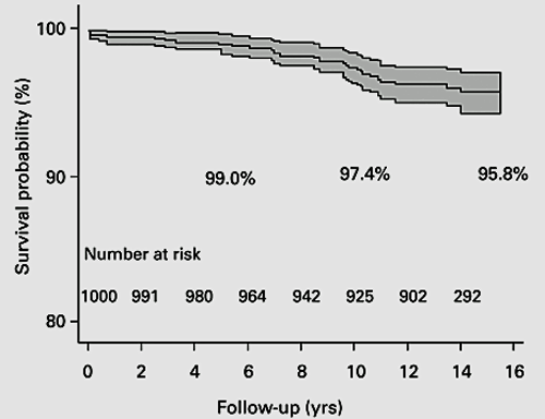
Figure 23 Kaplan-Meier survival analysis of Birmingham Hip resurfacing implantKaplan-Meier survival analysis of Birmingham Hip resurfacing implant.Graph shows the survival probability with 95% CI CI gets wider as the numbers at risk get smaller..Note that authors indicated how many participants were left at each stage following censoring.From Daniel et al. B Joint J 2014; 96-B: 1298-1306.
BS11STATISTICS24.png

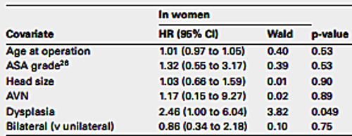
Figure 24. Cox regression analysis.The authors were interested to investigate the impact of several covariates on implant survival. Therefore they performed Cox regression analysis. In this chart which we can see that a diagnosis of dysplasia in women was the only statistically significant covariate increasing the risk of revision.

·       Therefore in a survival analysis it is important to show how many participants were censored.

·       In a survival analysis as the number of participants decreases with time the statistical estimate becomes less and less certain.

·       This is evident by the widening of confidence intervals from left to right.

·       Therefore one should be cautious about interpreting results on the far right of the curve especially when it is not known what was the population at risk (numbers left in the study).

·       It is also important to realise that in survival analysis what is calculated is the known survival time.

·       As it is not possible to know what will happen to censored patients as soon as a patient is censored the curve becomes an estimate.

·       Although authors like to estimate longest follow-up and the survival rate thereof it is best to look at the minimum follow-up time as the survival rate at this time is likely to be the most accurate.

·       An important assumption in survival analysis is that the probability of a participant being censored is not related to the probability of that participant experiencing the outcome of interest.

An example (Figure 25)

·         One thousand patients having a THR are followed up for 10 years.

·         Person –years at risk is 1000x10=10,000

  ·       If there were 100 revisions over 10 years the revision rate would be 100/10000= 1 per 100 person-years

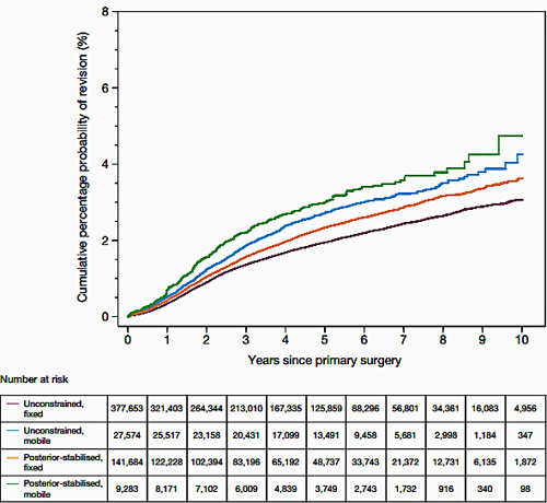
·       From National joint Registry,cumulative risk of revision for cemented primary knee replacement. It shows that of the implants used the posterior stabilised, mobile bearing TKR consistently had the highest risk of revision(figure 25).

·       Dataset indicates the persons at risk at each stage due to censoring.
BS11STATISTICS25.png

Figure 25. Survival analysis.Person –years at risk is 1000x10=10,000.If there were 100 revisions over 10 years the revision rate would be 100/10000= 1 per 100 person-years

·       In other words if patients drop out in large numbers from the trial because they are unhappy with the new THR implant then survival analysis will not be valid.

·       A benefit of survival analysis is that every participant contributes data to the study however short a period they remain in it.

·       The dependent variable in a survival analysis is known as a hazard.

·       If we consider revision as our outcome of interest then hazard is the risk of being revised at a point in time, having survived up to then without being revised.

·       When using survival analysis one cannot calculate the mean survival time as it does not take into account differing follow-up times.

·       One uses cumulative survival time (for example 10-year survival probability).

·       Log rank test is performed to compare the survival curves of two or more variables.

·       We use the Cox regression model to identify the effect of covariates on survival.

Worked out example of cumulative survival

·       Let us assume we begin a trial of a new THR with 100 participants.

·       At the end of year 1 there is one revision.

·       At the end of year 2 there are two revisions.

·       What is the probability of survival beyond year 2?

·       Survival year 0 = 100

·       Year 1 = 99/100

·       Year 2 = 97/99

·       Cumulative survival at year 0 is 100/100 = 1

·       So the probability of survival up to year 1 is 1

·       The probability of survival past year 1 is 99/100 = 0.99

·       Cumulative probability of survival to a point is calculated by multiplying the survival rates up to that point.

·       So the probability of survival beyond year 2 = 1 ´ 0.99 ´ 0.979 = 0.969

·       Both the log rank test and Cox regression model assume that the hazard ratio between the groups is constant over time, if this is not satisfied then the analysis is again invalid.

·       This is known as the proportional hazards assumption.

·       An example is to consider that if an implant has twice the risk of revision at year 1 it is assumed that the risk of revision is roughly the same throughout the time period.

·       This can be checked from the visual inspection of the plots but formal tests are also available.

National Joint Registry (NJR) data

Individual outcome data

·       It is useful to understand individual outcome data.

·       The y axis denotes standardised mortality ratio which is the proportion of deaths compared to the average.

·       The x axis denotes the expected mortality and adjusts for individual case mix to ensure that hospitals that operated on high-risk patients are not unfairly singled out.

·       Orange triangle identifies the result of the individual unit.

·       The central green line denotes the average national expected mortality.

·       The red line denotes the 99.8% confidence limit.

BS11STATISTICS26.gif

Figure 26. Mortality rate from NJR

·       Individual hospital outcome from NJR data.

·       90-Day risk-adjusted THR mortality for St. Elsewhere hospital.

·       The graph shows that the hospital’s mortality is well around the national expected mortality rate.

·       A position above the red line would indicate mortality outside the expected rate.

·       It also shows that the hospital did not perform THR in patients with higher mortality risk (not high on the x axis).

Diagnostic accuracy

·       Magnetic resonance imaging (MRI)is a very useful way of investigating the knee joint for suspected meniscal tears.

·       However, there are occasions when having invaded the knee joint with an arthroscope one finds that the results were not accurate.

·       This brings home the concept of sensitivity and specificity as well as positive and negative predictive value.

·       It is important to understand these concepts well for the sake of appraising published literature and also to be able to communicate results to our patients (given a negative Gram stain what is the likelihood I still have a septic arthritis of my knee, doc?).

·       Sensitivity and specificity: the best way to remember these two terms is to remember the acronyms SnOUT and SpIN.

·       SnOUT: sensitivity is used to rule OUT a disease.

·       Sensitivity: in simple terms it is the ability to pick up a disease.

·       In a highly sensitive test there might be a lot of false positive tests.

·       We cannot use it to rule in a disease but we certainly can to rule it out.

·       Sensitivity is therefore the proportion of people with the disease who have a positive test result.

·       Therefore in a highly sensitive test if you test negative we can rule out the disease.

BS11STATISTICS27.png

Figure 27.Spectrum of disease and the test

BS11STATISTICS28.png

Figure 28. Table for sensitivity.A test that is 84% sensitive will positively identify 84 out of 100 patients with the disease 

Specificity

·       SpIN: specificity is used to rule IN a disease.

·       Specificity is the ability to be specific about the disease.

·       A highly specific test will therefore have a lot of false negative results.

·       We cannot use it to rule out the disease but we certainly can to rule it in.

·       Specificity is therefore the proportion of people without the disease who have a negative test result.

·       Therefore in a highly specific test if you test positive we can rule in the disease.

BS11STATISTICS29.png

Figure 29.Specificity

·       A test with 75% specificity will be negative in 75 out of 100 people without the disease.

·       False positive rate = 1 – specificity.

·       A test that is 75% specific means that the test will be falsely positive in 25% cases.

Predictive value

·       These are related terms.

·       A positive predictive value (PPV) of a test is the proportion of the people with a positive test who have the disease.

·       A negative predictive value (NPV) of a test is the proportion of the people with a negative test who do not have the disease.

·       Both predictive values depend on the prevalence of the disease.

·       Therefore PPV would be larger if the prevalence is larger and vice versa.

·       Therefore:

o   PPV = a/a + b

o   NPV = d/c + d

Reliability of outcome measures

·       Outcome measures are frequently used in orthopaedics.

·       In assessing an outcome measure we need to assess a number of issues.

·       Validity (whether the instrument actually measures what it intends to measure).

·       Reliability: how consistent and stable an instrument is in measuring an outcome.

·       Responsiveness is denoted by Cronbach’s alpha and normal values are between 0.7 and 0.9.

·       Responsiveness: does the instrument detect meaningful clinical difference in outcome measure.

·       Ease of use.

·       Acceptability.

Measures of agreement

Inter and intra-rater reliability

·       Orthopaedic surgeons often disagree among themselves.

·       A common area of disagreement is when categorising fracture classification.

·       A statistical way to assess degree of disagreement for categorical variables is to estimate the Kappa statistic.

·       The kappa statistic (k) is an indication of the proportion of times that the observers agree compared to the agreement that would occur purely by chance.

·       Kappa has a maximum value of 1 which indicates perfect agreement.

·       The minimum value of 0 indicates that the agreement between the observers is no better than that expected by chance.

·       Kappa does not take into account the degree of disagreement between observers and near or partial disagreement is considered the same as total disagreement.

·       Therefore for ordered variables it is better to use weighted kappa which gives weights to different levels of disagreement:

Kappa values

Very good: 0.81 ≤ k ≤ 1.00

Good: 0.61 ≤ k ≤ 0.80

Moderate: if 0.41 ≤ k ≤ 0.60

Fair: 0.21 ≤ k ≤ 0.40

Poor: k < 0.20

Previous
Next

QUESTION 1 OF 15

Researchers were interested in assessing the effectiveness of a new hip implant in treating patients with neck of femur fracture. The control group was treated with dynamic hip screw. The trial was randomised and the assessors were appropriately blinded. There were 450 participants in each group. There was loss to follow up, some patients also did not receive the intended implants and therefore only 379 patients in the control group and 350 patients in the intervention group completed the trial protocol. The results were analysed according to intention to treat analysis.

QUESTION ID: 20

1. Intention to treat analysis is the best analysis option to minimise the effect of confounding.
2. Per protocol analysis is the best analysis option to minimise the effect of confounding.
3. Since randomisation was appropriately performed bias was eliminated from the trial.
4. The trial was at risk of allocation bias.
5. The trial was at risk of observer bias.

QUESTION 2 OF 15

Researchers were interested in assessing the effectiveness of physiotherapy compared to watchful waiting in patients with frozen shoulder. The primary outcome was self-reported shoulder pain using a 0-100mm Visual Analogue Scale (VAS). The minimal clinically important difference (MCID) was 16 mm. The authors concluded that physiotherapy was significantly highly likely to improve pain compared to watchful waiting (p=0.02, mean VAS for physiotherapy group was 36.2mm, mean VAS for watchful waiting group was 44.3mm). Which of the following statements is true?

QUESTION ID: 21

1. Physiotherapy is no better compared to watchful waiting for treatment of frozen shoulder.
2. The difference in pain relief between physiotherapy and watchful waiting was clinically significant.
3. There is a 2% probability that physiotherapy is more effective compared to watchful waiting for treatment of frozen shoulder.
4. There is a 2% probability that the difference in pain relief observed between the two interventions was due to chance.
5. Watchful waiting is significantly more effective compared to Physiotherapy.

QUESTION 3 OF 15

Authors concluded, in a separate study, the mean difference in pain relief between the intervention group and the control group as calculated using a 0-10mm VAS was 3.2mm (95% CI -1.1mm to 4.1mm). Which of the following statements is true?

QUESTION ID: 22

1. 95% of the control group reported -1.1mm to 4.1mm pain relief.
2. 95% of the intervention group reported -1.1 to 4.1mm pain relief.
3. 99% CI would give us a more precise estimate.
4. A p value would have been useful to calculate statistical significance.
5. The observed difference in pain relief between the intervention group and the control group was probably due to chance.

QUESTION 4 OF 15

Data distribution of a variable was displayed using the chart below: Which of the following statements is true?

Question 4.png

QUESTION ID: 23

1. A Box plot is a suitable chart to describe the data.
2. If we calculate 95% Confidence interval of the sample estimate this would suitably exclude 5% of the dataset.
3. Mean value is to the left of median value in the above chart.
4. Researchers could utilise a Student’s t test to test for null hypothesis.
5. The above dataset can be adequately described by the sample mean and Confidence Interval.

QUESTION 5 OF 15

Researchers investigated the efficacy of manipulation under anaesthesia vs hydrodilatation for management of adhesive capsulitis of the shoulder. Mean Constant score was noted before and after the procedure. Data was analysed using a t test. Which of the following is true?

QUESTION ID: 24

1. Data from the trial can be appropriately displayed in a box plot.
2. Mann-Whitney U test is an appropriate test for data with binary distribution.
3. The authors were required to be satisfied that homogeneity of variance existed before undertaking the t test.
4. The Constant score was normally distributed in this population.
5. Two sample t test would be an appropriate test for this trial.

QUESTION 6 OF 15

Researchers in a study found that MRI had a sensitivity of 90% and specificity of 60% for diagnosing medial meniscal tear after knee injury. Which of the following statements is true?

QUESTION ID: 25

1. 60% patients with a meniscal tear was identified in the MRI scan.
2. 90% patients identified as having a meniscal tear in the MRI scan had an actual tear.
3. MRI was false positive in 10% cases.
4. MRI would be a reliable test to rule out a meniscal tear.
5. The false positive rate for identifying meniscal tear was 1 in 10.

QUESTION 7 OF 15

An intrepid orthopaedic registrar plotted daily daylight hours and paediatric supracondylar fractures presenting at his local hospital. Hours of sunshine are plotted on the x axis and supracondylar fracture on the y axis. Which of the following statements is true?

QUESTION ID: 26

1. A linear regression equation would allow us to predict the number of supracondylar fractures for 24 hours of sunlight.
2. If there was 20 hours of daily sunlight we would observe at least 5 supracondylar fractures a day.
3. If there were no sunlight no children would suffer from a supracondylar fracture.
4. Increasing daylight caused increasing paediatric supracondylar fractures.
5. The given chart would demonstrate a correlation coefficient of >0.

QUESTION 8 OF 15

This is a chart showing risk of revision of a Total hip replacement implant. Which of the following is true?

QUESTION ID: 27

1. As the study progressed the uncertainly regarding the estimate of interest increased.
2. Censored patients did not contribute data.
3. Patients who died before completing the trial were withdrawn from the data analysis.
4. Patients who were lost to follow up were removed from the data analysis.
5. The graph allows a reliable estimate of mean survival time.

QUESTION 9 OF 15

Researchers conducted a pragmatic randomised trial to assess blood loss between a short dynamic hip screw vs cannulated screw fixation for undisplaced subcapital hip fractures. A sample size calculation was performed based on 80% power to detect 1gm drop in Hb. The requires sample size was 250 patients. The researchers recruited 250 patients, there was loss to follow up and 230 patients completed the study. Hb level was higher in the hip screw group ( p=0.056). Which of the following is true?

QUESTION ID: 28

1. A study that is powered 100% would need to recruit the entire population.
2. By calculating a power analysis the researchers avoided the risk of committing a type II error.
3. It appears likely that there is no difference in blood loss between the two interventions.
4. Proposed 1gm difference in Hb was not the minimal clinically important difference between the two groups.
5. The study was adequately powered to test the null hypothesis.

QUESTION 10 OF 15

Researchers conducted a prospective, randomised, non-inferiority study to compare the safety and efficacy of a synthetic cartilage implant vs 1st metatarsophalangeal joint (MTPJ) arthrodesis in advanced hallux rigidus. The authors concluded that the synthetic cartilage implant proved an excellent alternative to the 1st MTPJ arthrodesis in advanced hallux rigidus. Which of the following is true?

QUESTION ID: 29

1. 95% confidence interval of the median difference between the two treatment arms was calculated to assess treatment effect.
2. Statistical significance was tested using p value.
3. The aim of the study was to assess if a synthetic cartilage implant was a viable alternative to 1st MTPJ arthrodesis.
4. The null hypothesis of the trial was: synthetic cartilage implant was not inferior in safety and efficacy compared to 1st MTPJ arthrodesis in advanced hallux rigidus.
5. The null hypothesis of the trial was: there was no difference in safety and efficacy between a synthetic cartilage implant and 1st MTPJ arthrodesis in advanced hallux rigidus.

QUESTION 11 OF 15

A paired sample t-test is appropriate for which one of the following research designs?

QUESTION ID: 1229

1. Comparing bone mineral density between those with and without ankylosing spondylitis.
2. Comparing patient satisfaction with radiological outcome after ankle fracture fixation.
3. Comparing visual analogue scale scores after total hip arthroplasty and hip hemiarthroplasty following hip fracture.
4. Investigating patient-reported shoulder pain on a visual analogue scale before and after shoulder arthroplasty.
5. Investigating the proportion of pain relief on the visual analogue scale before and after hip arthroplasty.

QUESTION 12 OF 15

Which of the following is true?

QUESTION ID: 1341

1. An accurately measured variable remains constant for all participants in a sample.
2. As long as studies are accurately conducted and measured, the sample mean will remain the same for different samples
3. Every variable has a unique characteristic; it can not be converted
4. If one chooses the sample wisely and calculates variables accurately, the resulting sample mean will be the same as the population mean
5. Sample distribution is unique to the type of variable

QUESTION 13 OF 15

92.Researchers undertook a systematic review to investigate the efficacy of rib fracture fixation vs non-operative treatment in management of flail chest. The chart in Figure 16 is the result of a meta-analysis comparing the incidence of pneumonia between the two groups.
Which of the following is true?

S1.png

Figure 1 Forest plot comparing the incidence of pneumonia by operative versus non-operative management. A Mantel–Haenszel random effects model was used to perform the meta-analysis and risk ratios are quoted with 95% confidence intervals. Figure courtesy of Coughlin TA, Ng JW, Rollins KE, Forward DP, Ollivere BJ. Management of rib fractures in traumatic flail chest: a meta-analysis of randomised controlled trials. Bone Joint J. 2016 Aug;98-B(8):1119-1125.

QUESTION ID: 3268

1. A fixed-effects model meta-analysis was appropriate.
2. Because of the small number of included trials, the confidence interval of the summary estimate is wide.
3. Effects of treatment might differ between subgroups within the included population.
4. The wide summary estimate suggests that our confidence on the summary estimate is very high.
5. There was no evidence to reject the null hypothesis of heterogeneity between the included trials.

QUESTION 14 OF 15

93.Researchers investigated the outcome and long- term survival after high tibial osteotomy (HTO). Results were illustrated using the attached graph (Figure 16). The end point was conversion to total knee arthroplasty (TKA) (Figure 1).
Which of the following is true?

S2.png

Figure 1 Survival outcome after HTO (image copyright BMC musculoskeletal disorders, available under Creative commons license). Efe T, Ahmed G, Heyse TJ et al. Closing-wedge high tibial osteotomy: survival and risk factor analysis at long-term follow up. BMC Musculoskelet Disord. 2011 Feb 14;12:46.


QUESTION ID: 3269

1. 50% of participants survived 15 years or longer.
2. It is safe to assume that censored patients may have been at higher risk of revision.
3. Mean survival time is a useful parameter for this cohort.
4. The accuracy of the survival estimation curve remains constant over time.
5. The displayed Kaplan–Meier curve changes when HTO patients have a revision or are censored.

QUESTION 15 OF 15

91.If there is a less than 1:20 risk that a result has occurred by chance, what does that mean?

QUESTION ID: 3316

1. Confidence interval is less than 5%
2. Odds are 50:1 that the results are not due to chance
3. p value <0.05
4. Power of the study was insufficient
5. Result is not statistically significant